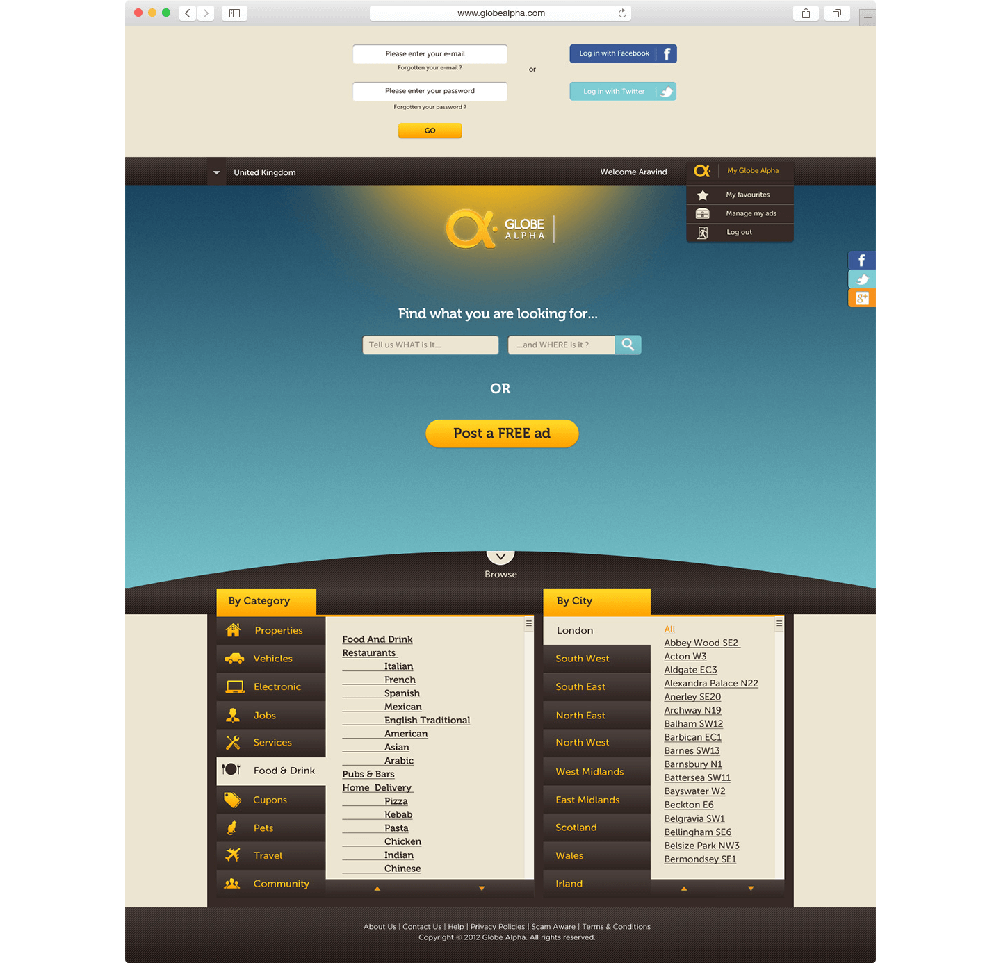
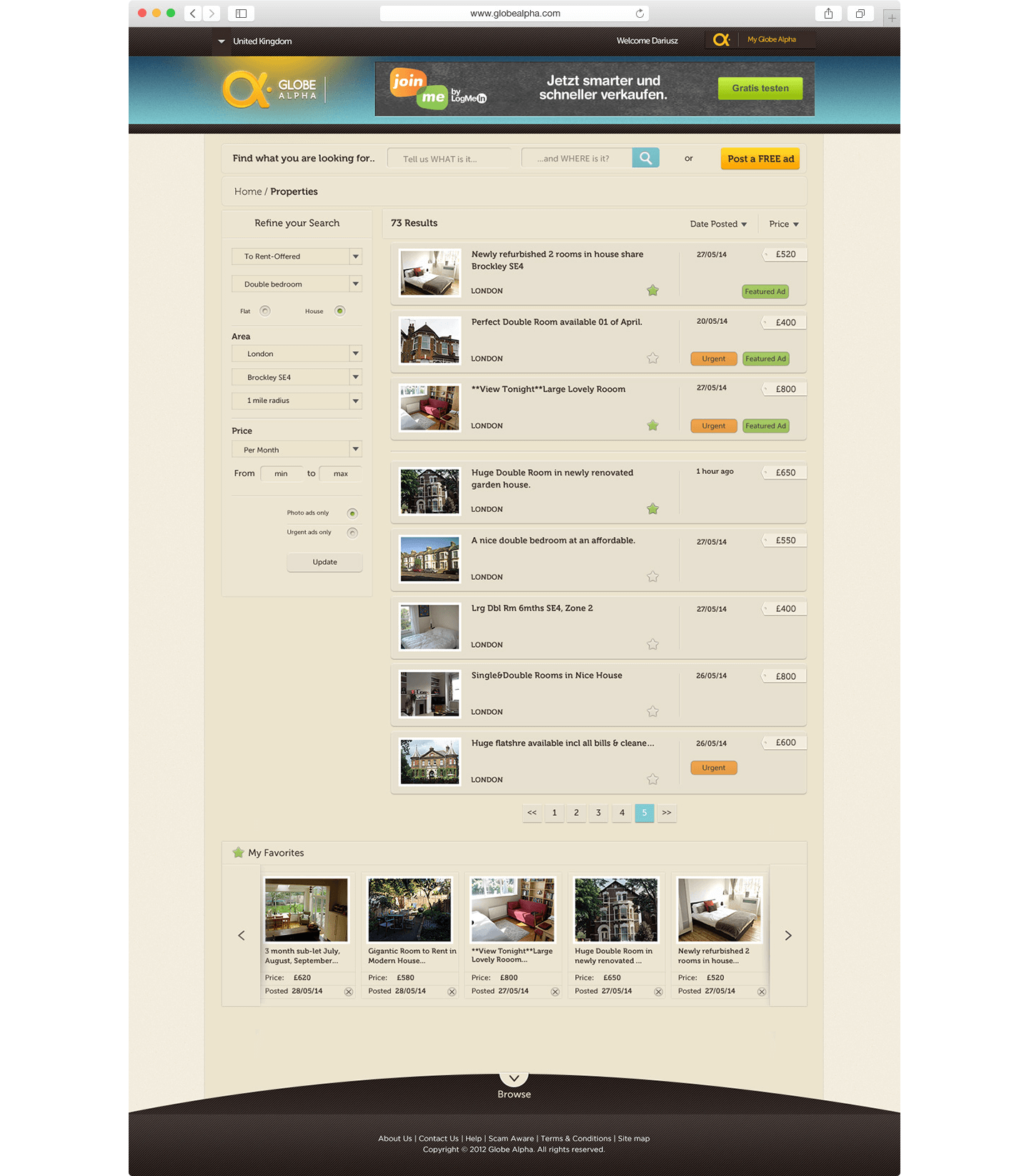
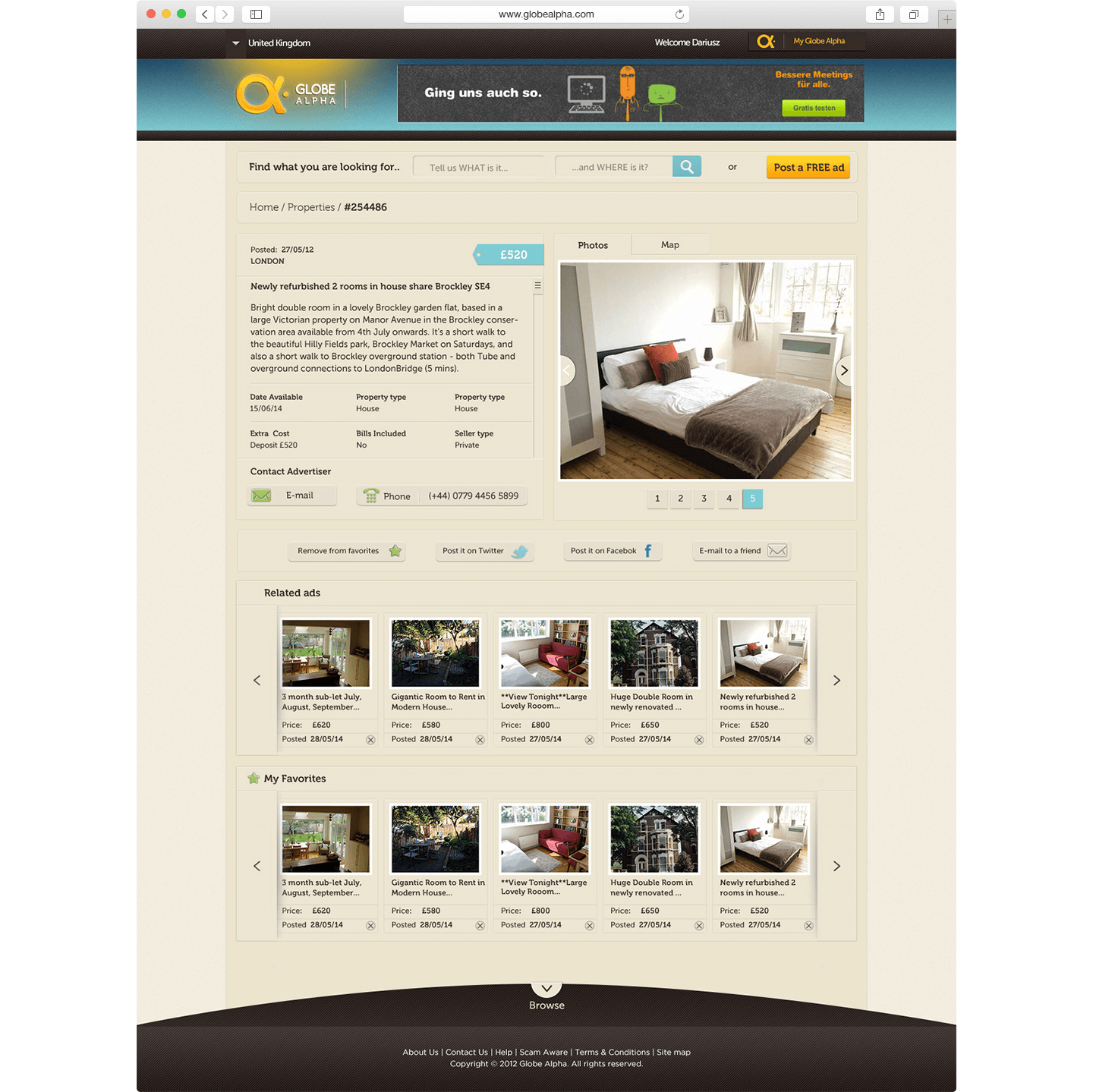
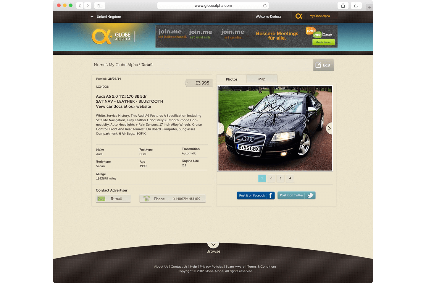
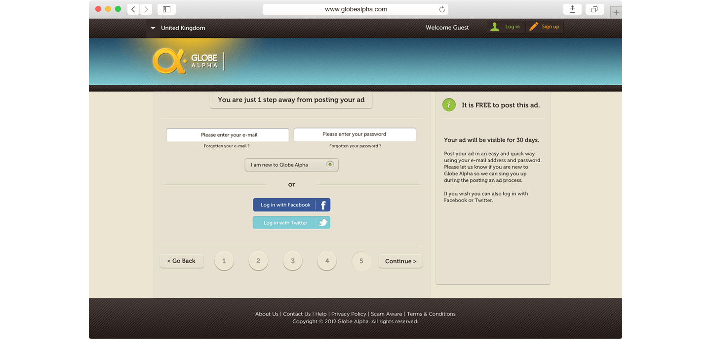
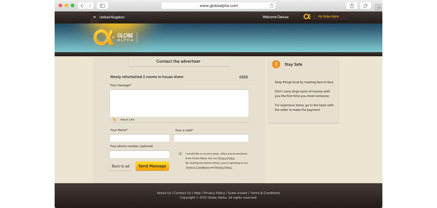
The base of the Globe Alpha brand is its core values and tone of voice. The idea of friendly, positive and safe cloud advertising has been conveyed by the usage of colours. The logo itself communicates the global ambition of the platform as well as the classifieds industry, combining the rounded alpha symbol with the white space in the shape of a tag.
Scroll | »
« | Top Page
Globe Alpha
Classified Ads platform — product design

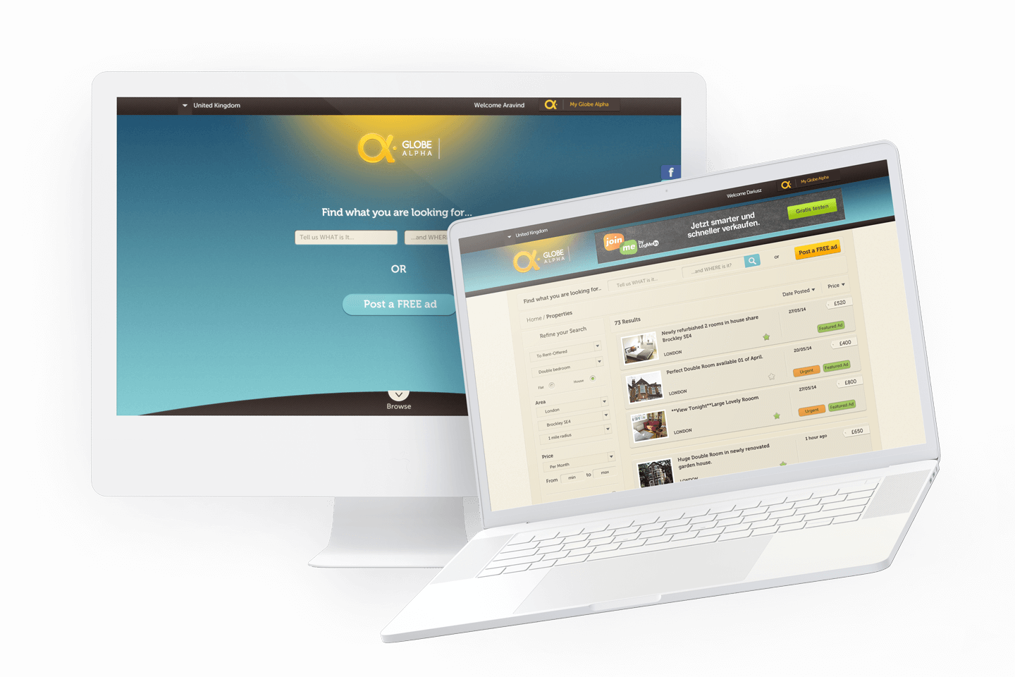
Taking an idea for a user-friendly classified ads platform to a live digital product, I created a brand and a website for an online service. Globe Alpha is a friendly web platform aiming to build a community helping each other to find accommodation, unwanted items, promoting their businesses or finding a job. The brand has the ambition to change a bad reputation of classifieds and to reach an audience around the world, first, launching in UK. The brand needs to convey an idea of friendly, easy and safe classified online advertising.


Creating visual identity


Crafted logo and monogram
The logo is a combination of an alpha symbol and a logotype creating a distinguishable mark and communicating the core values of the company. In order to keep the consistency of the brand the exact specification of its usage and allowed colour variations were included in the brand guidelines. Since Globe Alpha is an online service the symbol representing the brand has been designed to be used also as a monogram, working separately as a favicon and profile image on social media.

Typography
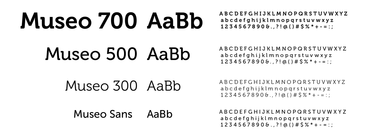
An essential part of the brand is its typeface. Museo font family design by exljbris.com font foundry was an ideal choice due to its geometric but friendly character. The slab version of the typeface works perfectly with the symbol of Globe Alpha and it's been used for headings. Paragraphs have been set in Museo sans.
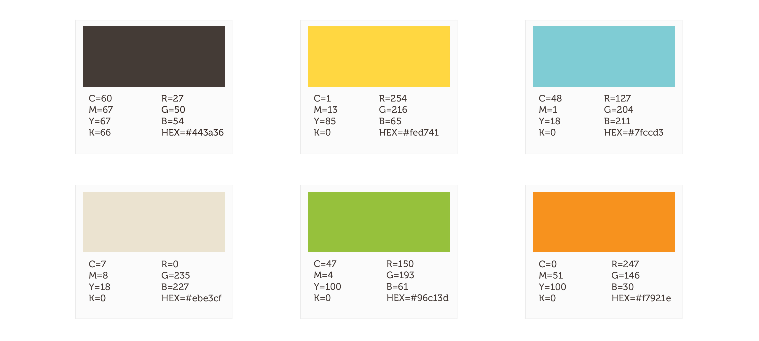

Color scheme & patterns
The colour scheme has been selected with colour psychology in mind and divided into primary and secondary. The primary yellow is the main colour of the brand as it creates a warm and friendly feeling. The blue sky colour represents the cloud-based form of the Globe Alpha platform and creates a feeling of safety while dark brown is more sophisticated and down to earth.


Platform pre-launch microsite
Designing and developing a launch microsite with a countdown clock helped to gather data on interested users for future email campaigns as well as to gain followers on the social network.
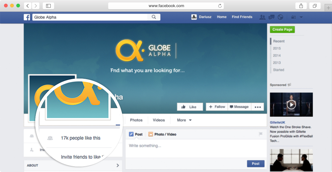

Social network presence
Globe Alpha Facebook and Twitter profiles have been created in order to spread the word on social networks and to direct users to the main website. Within a few years from the launch of the service, its facebook page reached 17k followers.


Merchandise and marketing
Globe Alpha took advantage of the 2012 Olympics and organized brand launching events across London, creating awareness of the brand. I designed giveaways, t-shirts and promotional flyers, which built interest among the crowd and created a very positive attitude towards the company.


Globe Alpha User Interface Design
Based on initial wireframes and UX I designed Global Alpha user interface applying the look and feel of the brand across all pages. Since the design needed to be provided to an outsourced web development company the source files have been thoughtfully structured in order to help developers replicate the design into a website
